Boosting The Conversion: Shift Creation Enhancements
Trial users got stuck on their first task in Planday: creating a shift. We rebuilt the shift modal and more than doubled first-session shift creation.


13% → 29%of trial users create a shift in their first session
Results
of trial users now create a shift in their first session.
is all it takes to create the first shift, down from 25.
Goals
Business goal
Get new users to their “aha” moment in the first session.
Product goal
Right information up front, less friction in the steps they repeat most.
My role
Part strategy, part hands-on design
I led design: coordinated the teams, kept designers aligned on our principles, and prioritised against our OKRs.
- Ran workshops to bring in different perspectives
- Shared what we learned, from Mixpanel data to user journeys
- Mentored designers and tested the mobile flow with Schedule Managers
Understanding the problem
Enough research to act on, and no more
Six sources, until the picture was clear enough to act. What users kept telling us:
- Shift duration is not immediately visible. Calculating it in my head takes a lot of mental gymnastics.
- What is the difference between breaks and break rules?
- Most scheduling rules and alerts are reactive. They don’t tell me at the right moment.
- It’s not clear who requested the shift and who can work.
- Which fields are required? I can’t save the shift and don’t know why.
- Who can see the shift note?
Where it came from: six sources
Feature requests
Over 2,000 requests about scheduling, summarised with our Product Analysts.
Intercom reports
Support conversations, reviewed and presented by two of our PMs.
Mixpanel data
Dashboards built with our Quantitative Researcher and PM.
Interviews
Small hospitality owners and schedule admins in the UK, plus our Customer Success team.
Team workshop
PMs, engineers, QA and designers mapped the problems together.
Tenets & Traps
A card exercise from Microsoft for spotting design traps.
Then we prioritised. Quick wins shipped first, bigger changes in later iterations.
What was broken
The old shift modal
The heart of Planday was legacy code, with poor accessibility and usability problems at every step.
Seven problems we found. Pick one to see it.
These screens come from the refactored version.
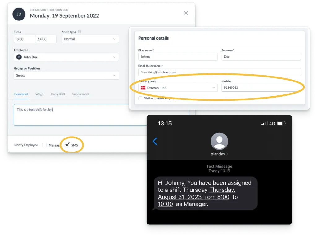
Texts to the wrong people
Without phone verification, a shift SMS could reach any stranger’s number.
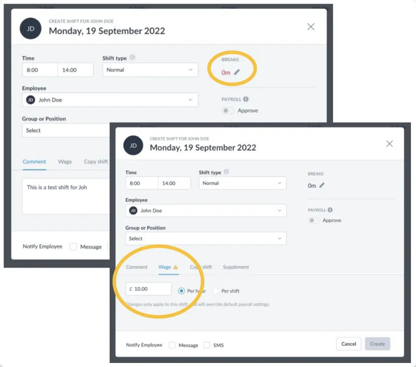
False alarms
Empty breaks showed red like an error, and the Wage tab warned for no reason.
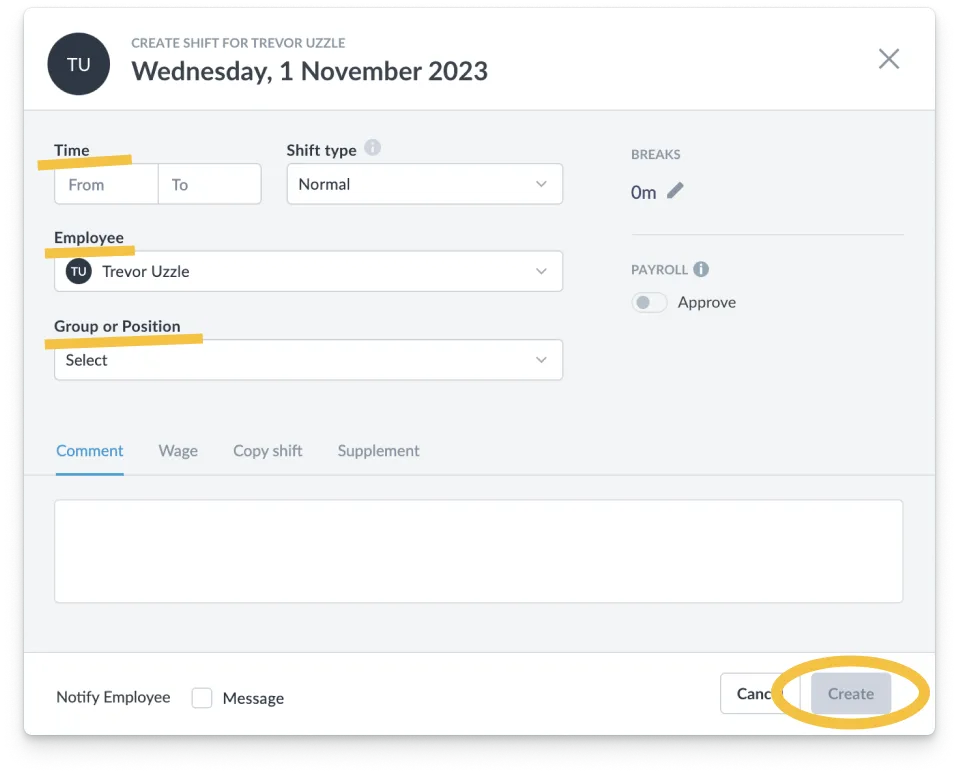
No validation, no required fields
Create was disabled without saying why. In a new account, a required Group made the first shift impossible.

Errors only after saving
Clashes and rule breaks only appeared after submitting, so fixing them was trial and error.
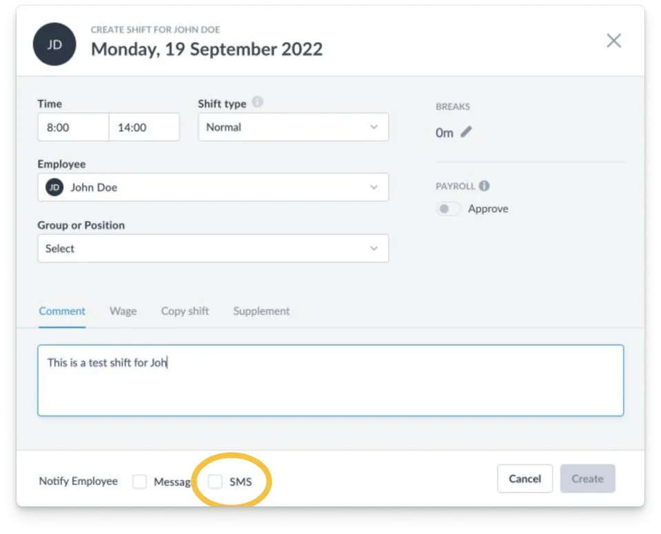
Costs nobody mentioned
SMS cost extra, silently, so Support kept explaining surprise invoices.
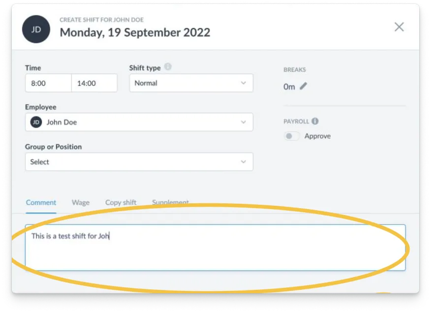
Private notes, not so private
Nothing said who sees a comment, so private notes reached other employees.
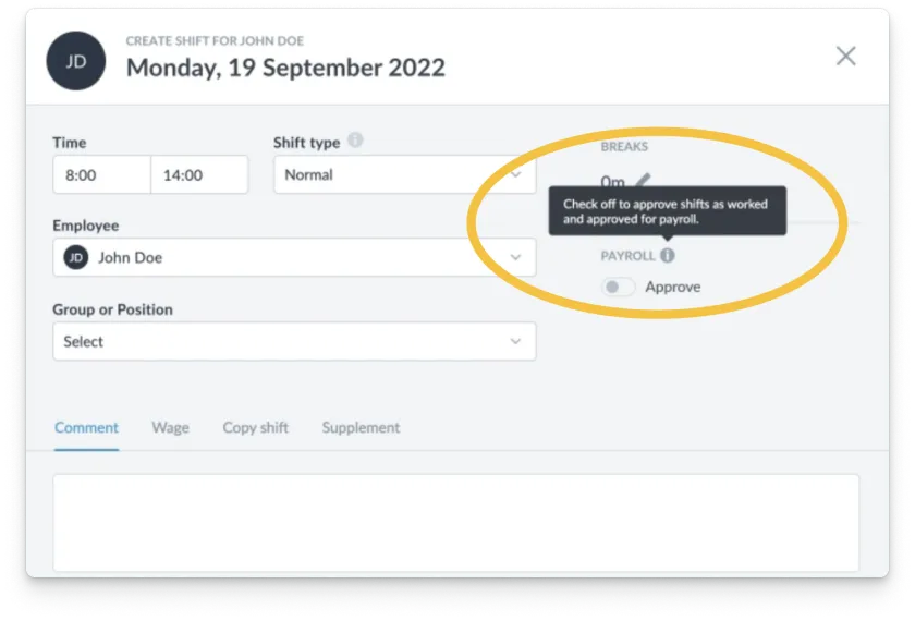
Instructions hidden in tooltips
Key instructions hid in inaccessible tooltips, and some were wrong.
What we built
A shift modal that helps instead of blocks
Some ideas fixed problems directly, others moved logic onto new components. A few were saved for later.
Six things I’m proud of. Pick one to see it.
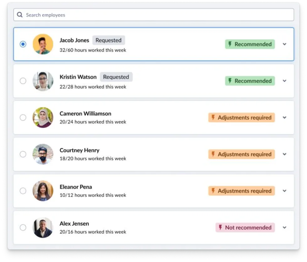
Who fits best
See who’s available and who would break a rule, before assigning.

Colleagues at work, and comments
See who else is on, and who can read your comment.
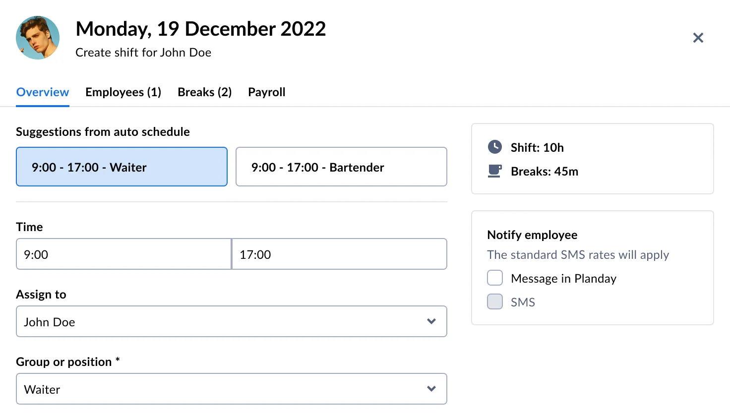
Time and role suggestions
Suggestions fill the usual times and roles in one click.

Quick shift creation
Create a shift from the schedule with only what you need.
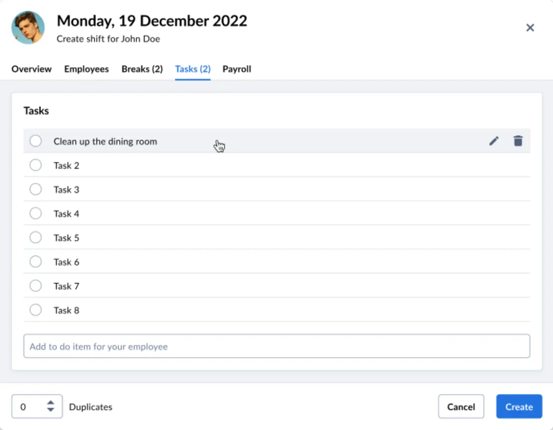
Tasks on the shift
Room for tasks on the shift itself.

Repeating shifts that make sense
Pick days and a range, and see how many shifts you’ll create.
Impact
Shipped, and better than we hoped
First-session shift creation went from 13% to 29%, and time to the first shift from 25 minutes to 6.
Bonus: other teams could finally build on the modal.
Thanks for reading!